The Relationship Between Station Popularity and Trip Duration
Here is an hypothesis about bike trips:
"There is a negative association between urban density and duration of bike trips. Stations in dense urban areas with lots of commuters are very highly-traveled, and commuters tend to take very short trips. Stations in less-urban areas have fewer trips (since these areas are less populated), but a larger proportion of these are longer excursions. Therefore, there is a negative non-causal association between station popularity and average trip duration."
How might we use data to test that hypothesis?
A scatter plot of the stations, showing trip count against average duration, would be a fine place to start. To do that, we'll need a table that looks something like this, but filled in:
| Start Station | Average trip duration | Number of trips |
|---|---|---|
We can begin by using group to identify the most highly used Start Station:
starts = trips.group('Start Station').sort('count', descending=True)
starts.barh("Start Station", "count")
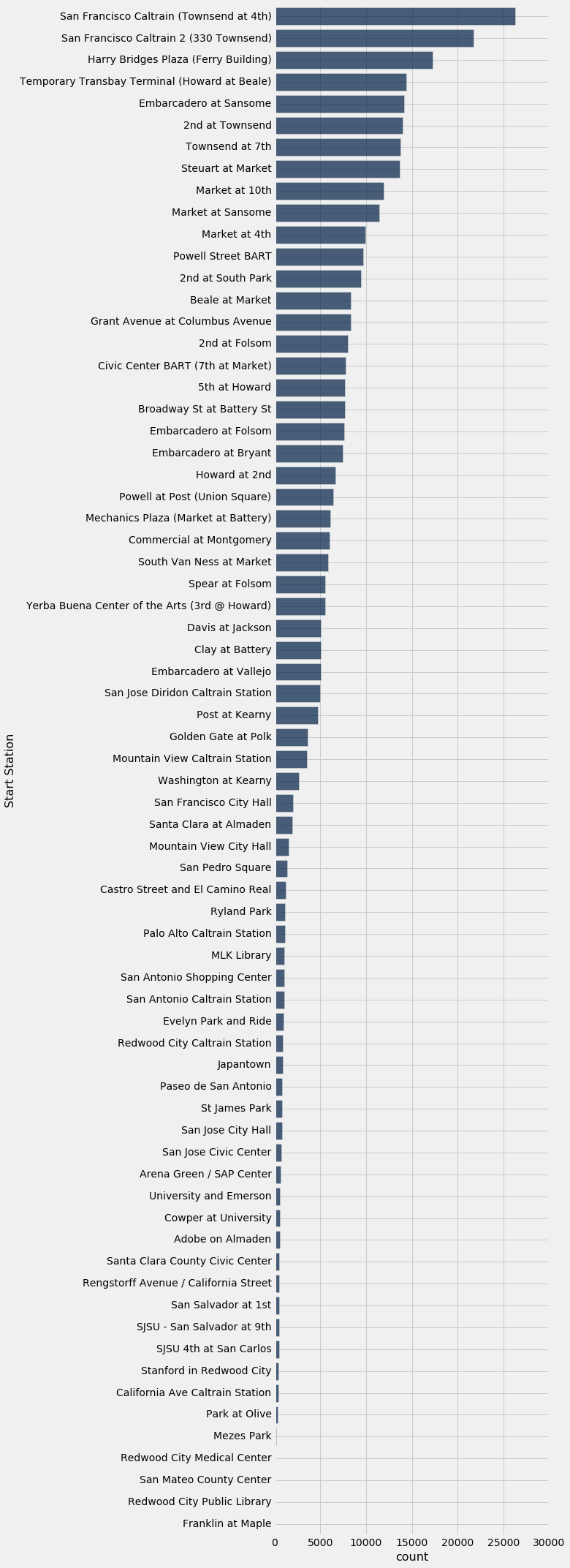
The largest number of trips started at the Caltrain Station on Townsend and 4th in San Francisco. Many trips also start at the Ferry Building, which is the first BART station for passengers from the East Bay. People take the train into the city, and then use a shared bike to get to their next destination.
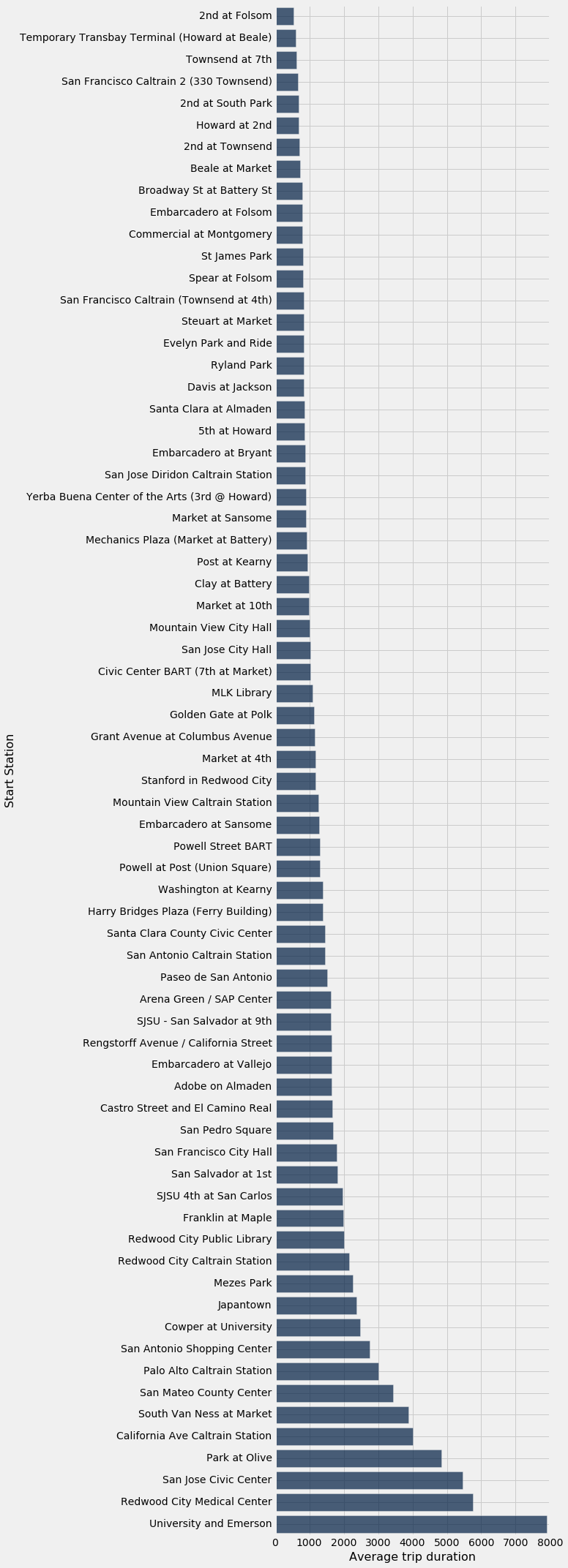
We can again use group to compute the average (mean) duration of trips from each station:
duration_by_station = trips.select('Start Station', 'Duration')\
                           .group('Start Station', np.mean)\
                           .sort("Duration mean")\
                           .relabeled("Duration mean", "Average trip duration")
duration_by_station
duration_by_station.barh("Start Station", "Average trip duration")
Putting the data together
Now we will need to put both the trip count and average trip duration in the same table. Later, you may learn about a method called join that can perform tasks like this. However, we can do it with apply by following these steps:
- Write a function that takes a single station name and returns the trip count for that station. It will use
whereto look up the trip count in thestartstable we previously computed. applythis function to the "Start Station" column induration_by_station.- Add the resulting array of trip counts to
duration_by_stationas a new column.
# Step one:
def find_trip_count(station_name):
    return starts.where("Start Station", are.equal_to(station_name)).column("count").item(0)

# Step two:
counts = duration_by_station.apply(find_trip_count, "Start Station")

# Step three:
durations_and_counts = duration_by_station.with_column("Number of trips", counts)
durations_and_counts
Now we can use scatter.
durations_and_counts.scatter("Number of trips", "Average trip duration")
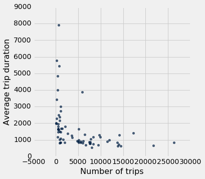
For stations with a very small number of trips, the average trip duration is sometimes quite high. Otherwise, the graph is somewhat flat, with perhaps a slight downward trend.
This establishes the second part of our hypothesis: there is a negative association between station popularity (number of trips) and average trip duration. To gather evidence for the first part of our hypothesis -- that there is a negative assocation between urban density and average trip duration -- we need to verify that the stations with high average trip durations are near urban areas.
We could use the optional labels argument to label the points in the plot.
durations_and_counts.scatter("Number of trips", "Average trip duration", labels="Start Station")
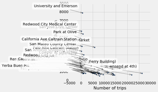
Unfortunately, even if you happen to know the Bay Area well, there are too many points to get an overall picture of where the low-trip stations tend to be.